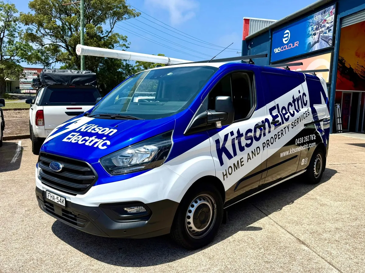

Kitson Electric’s Ford Transit uses a strong blue, white and black layout to give the business a clear presence on the road. The angled white band carries the Kitson Electric name and “Home and Property Services” message, while the larger blocks of colour make the van recognisable from a distance. The layout was developed as a dedicated design package before moving into production and installation.
The finished design combines solid-colour wrap film with profile-cut lettering and selected printed elements. Berry-blue and gloss-black films form the main colour treatment, with white lettering, a printed QR graphic and one-way window graphics completing the branding. This mix creates a bold commercial appearance while letting each part of the layout use a material suited to its role.
Big Colour supplied the artwork and installed the van graphics at Gateshead. The result shows how colour-change films can form part of a business wrap, with the brand name and service message built into the same overall design.